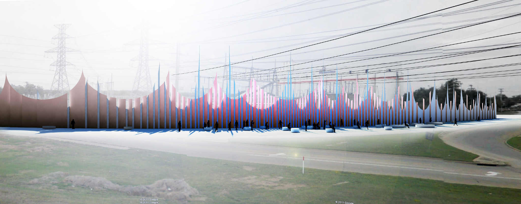
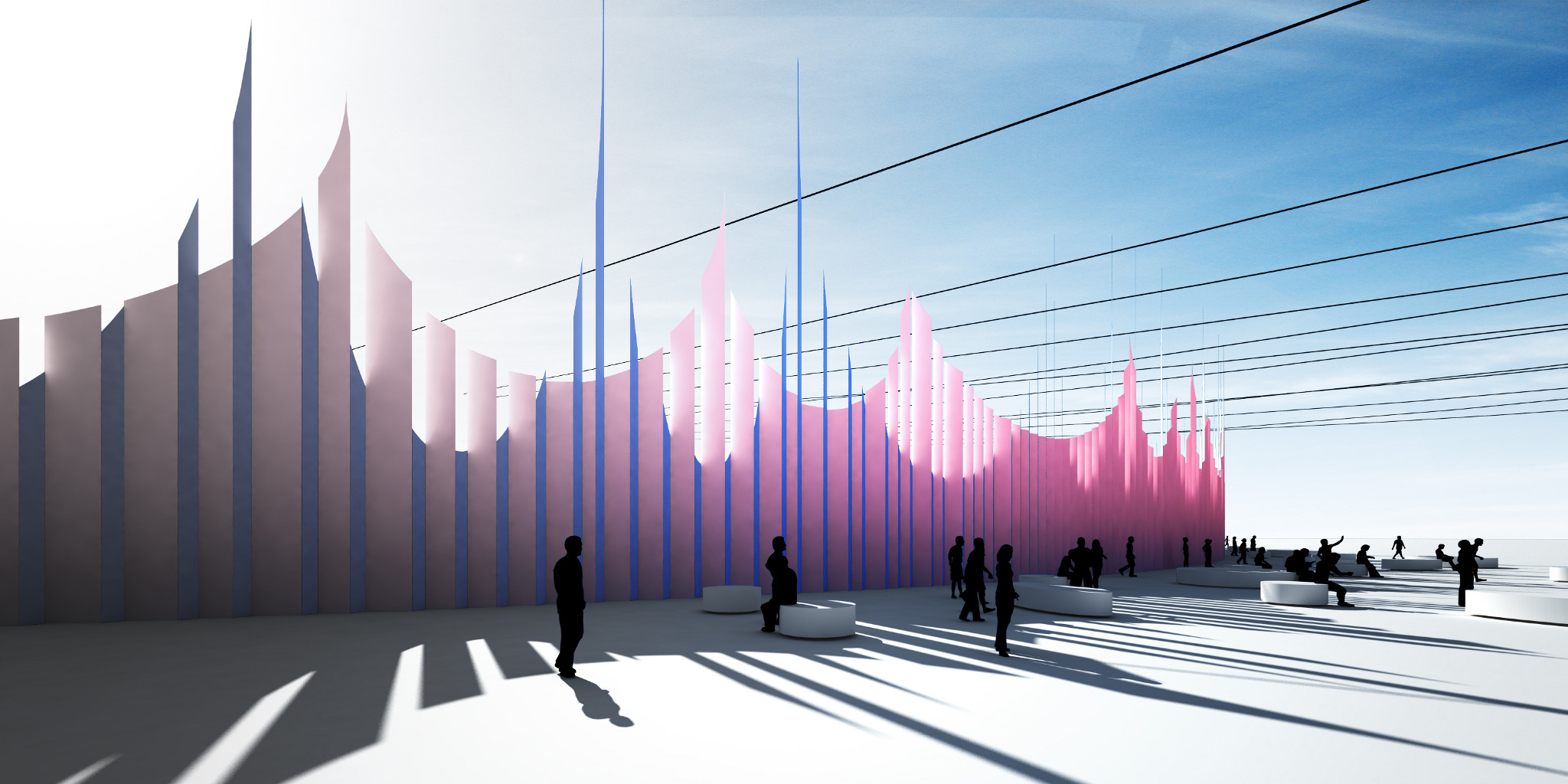
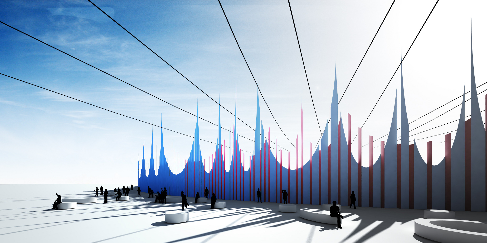
Contemporary cities lack colors. Masters in the modern era have created a dogma under which irrational decoration or ornament which does not contribute to function is generally avoided. If we still believe in the ‘form follows function’ paradigm, how should we look at the substation which is located, designed, and operated purely based on the function of providing a much needed service to everyone? Do we perceive the current situation as the most pure form and aesthetic of the 21 Century city? No. I suggest “Color of Substation” - the ornament of functions contemporary people need.
First, color as an ornament gives sense of direction and place. It is a core tool of way finding, as Kevin Lynch has explained in his book The Image of the City. Rather than deal with the scale or socio-political importance of the place, it is easier to create an additional landmark or node solely through the use of colors. And, it is a benefit to the city because adding landmarks and nodes contributes to the richness of in the city experience. To add a layer of complexity, this project suggest a folded metal wall which consists of bi-directional of faces. Because the site is surrounded by two major roads, one side of the folding face is parallel to the first road and the other side is parallel to the second road. Each side panel has its own color (red and blue) and associated shapes. As a result, when we approach to certain direction, only one color and shape is visibly, while the other color and shape are only perceived when approaching from the other direction.
Second, I suggest a dressing for the substation to generate its full identity. It creates a clear separation of the restricted area and provides a distinct area for public space. Without the wall, the blurred area is considered to be abandoned or dangerous. The more clearly we suggest the existence of wall, the more clearly we reclaim this public space. Most of time the sun comes from the side of the substation, which is South of the road. Therefore, the crown-like cutting of wall will render very active and sharp shading patterns within public area right in front of wall. The shadows will sensitively respond to time. The top of the wall, which is at a sharp pitch will be lower than the necessary overhead line. However, if it is allowed, the pitch can happen between the overhead lines to embrace the gesture.
The only effective intervention to the substation is the creating wall surrounded with it, meaning a new dress for the substation. By using “Color of Substation” and intentional variation of color and shapes depending upon direction of approach, we will provide a strong identity, and the substation can transform into a new landmark of Dallas in the peoples’ mental map.